On the surface, it looks true: correlation with the S&P500 index, since inception, is 11%, and the linear regression doesn’t even have good explanatory power (t-stat is weak, only 1):
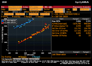
But it you look closely at the above graph, you’ll notice two areas clustered around two diagonals, one in the top left corner and the other around one of the main diagonals. The graph below makes that more clear:
In fact, correlation with the S&P500 has been atrociously high over two distinct periods: from inception to end of December 2007, when correlation was 97%; and from the end of October 08 to present, when correlation has been 92%. Only 10 months of returns are spread out in a random/uncorrelated fashion between the two periods. This shift in correlation regime, to use technical words, created the “Z-shaped” plot of the first graph, which of course fools linear regression and entails an artificially low correlation for the whole period.


No comments:
Post a Comment