
Monday, August 31, 2009
Follow Up on the White/Red/Green Eurodollar Butterlfy Trade
On August 11, we posted that the 1:2:1 butterfly on White/Red/Green Eurodollar packs had reached levels not since since 2005. Since then, the butterfly has retraced nicely -- not enough yet to bring large profits, but worth noting.

TALF Financing for Legacy CMBS
The New York Fed announced today $2.1 billion of TALF financing for legacy CMBS. According to Bloomberg data, this compares to more than $50bn of CMBS paper, comprising 107 securities, that are eligible under the program. These securities range in size from just $30mm (CSMC 2006-C3 A2) to huge deals of almost $1.4bn (JP Morgan's JPMCC 2005-LDP5 A4). Clearly, there will be serious competition to get TALF financing.
Saturday, August 29, 2009
Investment Strategies in Mortgage-Backed Securities
A lot of money is being raised to invest in mortgage-backed securities (MBS). In this post, I'll try to analyze some of the strategies currently used by MBS funds, in particular how they put to work the different and sometimes opposite properties of some of these securities -- specifically, so as to hedge one security with another.
First, a pool of fixed-rate mortgages can collateralize two (or more) bonds: a floater, such as a CMO, and its complement, an inverse floater. The floater bond pays a coupon above LIBOR, and the inverse floaters pays some base coupon less LIBOR, the sum of both coupons being almost equal to the average coupon of the fixed-rate mortgage pool after subtracting some administrative costs and an arbitrage profit for the issuer.
Why arbitrage? Because there is demand for both products of the new structures: inverse floaters are useful to firms having floating assets and fixed liabilities, for example, and high-quality floaters are appealing to other players for symmetric reasons. In fact, a GNMA CMO is one of the few ways to get a floating bond rate, in large size, with explicit US Government support. This relatively high demand makes the coupons of the floaters and the inverse floaters relatively low, low enough for the issuer to squeeze in their spread.
A CMO can then be stripped into several bonds, including interest-only (IO) bonds and principal-only (PO) bonds. Note that, since the PO does not receive interest, the interest received from the collateral can be passed to the other bonds, increasing their coupon. For example, a $100mm pass-through paying 6% can be split into a $25mm PO and a $75mm bonds paying an 8% coupon. Each bond has opposite sensitivity to prepayment: since the holder of a PO bond gets their money back faster when prepayment accelerates, POs benefit then. In contrast, an Interest-Only (IO) pays interest for a shorter period if the loan is paid off earlier, so the mark of an IO suffers when prepayments accelerate. Because prepayment speeds depend in part on interest rates, POs tend to benefit and IOs tend to suffer when rates decrease.
An inverse IO (IIO) is an IO with an inverse floating coupon, created by carving out a floater from a fixed-rate bond but more typically from a CMO tranche. Again, the sum of the two floating coupons will be close to that of the original bond. For instance, an 8%-fixed bond can be split into a floater paying a coupon of L+50bp capped at 8% (the coupon thus ranging from 0.5% to 8%) and an inverse IO paying 7.5% less LIBOR, usually but not necessarily floored at 0%. IIOs and inverse floaters are frequently sold at deep discount and are eligible to financing in the form of relatively long-term repo. Because of the discount and leverage, IIOs and inverse floaters can offer very high yields when the yield curve is steep. Inverse IOs are thus a levered way to take advantage of slow prepayment speeds.
The duration of a floater is small – basically, equal to the time until the next coupon reset date. Its duration is definitively smaller than that of the original fixed-rate coupon, and the duration of the inverse floater is larger than that of the fixed-rate bond. (When rates increase, an inverse floater provides smaller coupons discounted at a higher rate.) The duration of an IIO, however, is extremely short or even negative – i.e., the price of an IIO can increase when rates increase.
That’s not the end of the slicing and dicing! The cash flows of a (non-IO) inverse floater can in turn be used to create a Two-Tiered Index Bond (TTIB). The coupons of a TTIB depend on LIBOR: if LIBOR stays in a first range a.k.a. “tier,” below a certain strike, a TTIB pays a relatively high fixed coupon. If LIBOR steps above the strike, the TTIB coupon becomes inversely proportional to LIBOR. The second tier is when the TTIB coupon reaches 0, at a LIBOR rate called the LIBOR cap. As a hedging tool, a TTIB is a security that hedges against low interest rates; the diagram of its coupon as a function of LIBOR has a “spread” shape: high and flat when LIBOR is below the strike, linearly decreasing to 0 when LIBOR is between the strike and the cap, and 0 above the cap.
Many of the bonds discussed above can show up as different tranches of the same CMO, thus based on the same collateral. The screen shot below shows the example of a Bank of America CMO. We can recognize several PO’s, several IIOS (showed as both “IO” and “INV”), and several floater (FLT) bonds.

Many hedge funds are currently assembling portfolios using the different securities described above, and use the different and sometimes even opposite properties of these securities to hedge one security with another: Portfolio duration can be reduced or neutralized using IIOs; prepayment sensitivity at the portfolio level can be hedged by mixing POs and IOs/IIOs; interest rate risk can be hedged by matching floaters with inverse floaters. The important point to take away here is that a long position can often be hedged by other long positions.
Monday, August 24, 2009
ABCP Market: Impact of the Fed's CP Funding Facility
In an earlier post, we noted that the volume of Asset-Backed Commercial Paper (ABCP) has dropped precipitously. One explanation I heard was that the Fed stopped supporting such paper, and indeed the CP Funding Facility (CPFF) program seems to be dwindling:

Is that enough to explain the drop in ABCP volume? A quick linear regression, over the period since the CPFF was launched, answers that question:

With an R squared of 88%, it does seem that the Fed was the life support to the ABCP market.
Friday, August 21, 2009
Who Still Needs The Fed's Backing?
Interesting to see who has recently issued bonds guaranteed by the Fed through its Temporary Liquidity Guarantee Program. The month of issuance is on the x-axis (in YYMM format), and the amounts issued are given on the y-axis (in thousands of dollars, so the peak is at about $78bn).

(Source: Bloomberg. Click to enlarge)
Although quite a few institutions used TLGP to issue debt for cheap (thanks the the Government guarantee, the yield paid to investors could be low), it is apparent that mostly Citi and American Express still need the Fed's backing, since both issued government-guaranteed bonds in April, May, June and July. Other entities that recently enjoyed the government's backstop: GMAC issued $4.5bn of government-guaranteed debt in June, USB about $1bn in May, and JP Morgan $2.3bn in April.
Thursday, August 20, 2009
When Even Banks Had to Turn to The Fed to Borrow
The chart below overlays the total borrowings of depository institutions from the Fed, in $bn (source: Fed Bank of St Louis) on the spread between 3-month LIBOR and the 3-month OIS (source: Bloomberg), which is a measure of the cost of lending between banks.

(click to enlarge)
Intuitively, if for a bank the cost of borrowing from another bank becomes too onerous, and if access to capital markets is frozen or too slow, the (only?) alternative is to borrow from the government. The graph makes this relationship obvious: the cost of borrowing, in blue, jumped in September 07. Fortunately the government came to the rescue, and as the pink line shows, it lent up to $450bn.
Wednesday, August 19, 2009
Quarterly Changes of Home Prices, S&P500 vs that of the U.S. GDP
A previous post was about the S&P/Case-Shiller Home Price Index rising faster than US GDP. This can also be seen by plotting the quarterly percent changes of both indices. It's a bit geeky and makes for a busy chart, but at least we can clearly see the long period shown in green, stretching from 2000 to 2006 (and even starting in 1997 if we omit a couple of red quarters) during which the Home Price line, in amber, was significantly higher than the white GDP line. That is, during that time frame, home price changes where greater than GDP changes, on a quarter-to-quarter basis. This of course was not sustainable.

(click to enlarge)

(click to enlarge)
Note that, before this long period of excess return on home prices, neither index was systematically increasing faster than the other, resulting in a pattern of red and green areas. These areas were smaller, too, indicating the differences between the two indices were tight and short-lived.
Interestingly, we see a similar phenomenon today with the S&P500 index: The S&P500 is plotted as a white line; red areas indicate period when the stock index rose faster than GDP, quarter-to-quarter.

From that standpoint, it looks indeed like the equity market is ahead of itself.
Friday, August 14, 2009
Negative Repo Rate
On Bloomberg, Wednesday Aug 12: The repo rate on a Treasury (the 3-year note) went negative, -5bp. So, since someone shorting a Treasury is long cash and invests that cash at the repo rate, the negative rate means that this market participant will have to pay to short the note. One reason could be to reduce the number of shorts failing, i.e., to reduce the number of participants who have recently failed to deliver shorted Treasuries.
Note that, on the other side of the trade, if you use the repo market to borrow and go long a Treasury that the shorts have a hard time delivering (squeeze), you are effectively paid to borrow.
Note that, on the other side of the trade, if you use the repo market to borrow and go long a Treasury that the shorts have a hard time delivering (squeeze), you are effectively paid to borrow.
Thursday, August 13, 2009
TED Spread At Lowest Level Since Beginning of Credit Crunch
The TED spread, i.e. the difference between USD LIBOR and US T-Bill rates (all 3-mo), is one measure of stress in interbank lending. It just reached its lowest level since the credit crisis began.

(click on graph to enlarge.)

(click on graph to enlarge.)
Bid-Ask Spread on the CDX IG: A Gauge of Fear & Volatility
The VIX index, measuring the volatility of the S&P500 index, is also known for being a gauge of fear in the market place. It is thus interesting to note how correlated it is to the bid-ask spread charged by desks making a market in the CDX IG index.

(The bid-ask spread is calculated within Bloomberg by the expression ASKPRC[IBOXUMAE Curncy] - BIDPRC[IBOXUMAE Curncy]. As usual, click on the graph to enlarge.)
This relationship will not surprise anyone who has been around a CDX trading desk in H2'07 and in 08... It's just striking to see how similar the two graphs are.
Apparently, credit markets got jittery ahead of equities at several occasions: first in July 07, when the bid-ask on IG reached 75bp then 1pt before the VIX touched 25; the spread then broke its then-record 2 points before the VIX broke its then-record 35; and it peaked before the VIX did. Its current level seem to forecast that S&P500 volatility should stay subdued for now.
Tuesday, August 11, 2009
When the S&P/Case-Shiller Home Price Index Was Rising Faster Than GDP
Always easy to say in retrospect, but a sure way to tell that an asset class is a bubble is when its value increases faster than GDP for a long period of time. The chart below plots US GDP (in white) and the S&P/Case-Shiller home price index (in amber) from 87 to Q2'09. At beginning of this century, home prices started to raise faster than GDP -- which couldn't last long.

(click to enlarge)

(click to enlarge)
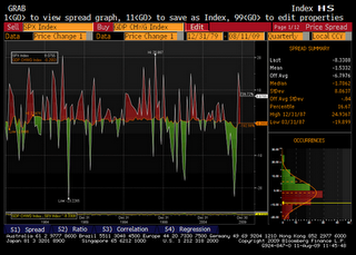
Butterfly on White/Red/Green Eurodollar Packs
For those trading Eurodollar packs and willing to play the mean reversion of butterflies, the 1:2:1 White/Red/Green fly is at a level not seen since early 2005.

(click to enlarge)

(click to enlarge)
Monday, August 10, 2009
ABCP: Ouch!
The graph below is the amount of ABCP (asset-backed commercial paper) outstanding, in billion of dollars. The source is obviously Bloomberg, which itself cites the Federal Reserve.


Maguire Properties: Impact on CMBS
Maguire Properties announced today that it will dispose of some of its assets. According to the press release, the firm will "dispose of four former EOP/Blackstone assets" and will "no longer continue to fund the cash shortfall associated with (..) mortgages" on several other assets.
Maguire Properties also "entered into loan modifications to amend the financial covenants of (their) Plaza Las Fuentes mortgage and Lantana Media Campus construction loan effective as ofJune 30, 2009 ."
Surprisingly, the issues at Maguire may not have a significant impact on CMBSs. According to Bloomberg (page TLKU), Maguire is a tenant in just a handful of loans securitized in CMBSs:
Maguire Properties also "entered into loan modifications to amend the financial covenants of (their) Plaza Las Fuentes mortgage and Lantana Media Campus construction loan effective as of
Surprisingly, the issues at Maguire may not have a significant impact on CMBSs. According to Bloomberg (page TLKU), Maguire is a tenant in just a handful of loans securitized in CMBSs:
- GSMS 2005-GG4, where Maguire owns part of the Lantana Campus mentioned in the press release. But Lantana Campus is only 2.54% of the CMBS.
- GSMS 2006-GG6 and CGCMT 2005-C3, backed among other assets by a property at 1733 OCEAN AVENUE. This property is only 0.88% and 0.32% of the two deals, respectively.
- MSC 2007-IQ14, whose underlying loans include Corte Madera Plaza owned by Maguire, accounting for 0.24% of the collateral.
- GSMS 2007-EOP, whose loans include Austin Research Park I & II, an asset representing 0.01% of the CMBS collateral.
Saturday, August 8, 2009
Prepayments Speeding Up? Not So Fast.
There have been rumors recently that mortgage prepayments are picking up, which would have a major impact on the values of Principal Only (PO) and Interest Only (IO) mortgage-backed bonds. I've heard CPRs in the high double digit, close to 100.
Maybe. But high CPRs do not necessarily mean sustainable prepayment speeds, nor a statistically significant phenomenon. The reason is, some MBS with current high CPRs have few loans as collateral, and just one or two mortgages prepaying in the same month will cause the (annualized) CPR to soar.
For example, the Citigroup Mortgage Loan Trust PO below had, as of June 09 (header of the third column) just 17 loans outstanding (2nd row). The (again, annualized) CPR of 100 that month (3rd row from bottom) can be explained by few simultaneous refis.

(Click to enlarge)
Likewise, Wells Fargo MBS 2005-9 2APO, another PO, has just 20 loans as collateral. Its CPR has been flat at 0.00, until last month when it reached 72.10 -- which, again, can be explained by just a few refinancings out of the 20 mortgages.

But nothing yet looking like a widespread trend.
Friday, August 7, 2009
Correlation of short vs long ETFs, again: the curious case of the ProShares UltraShort Real Estate fund
The correlation regimes of short vs long ETFs is making headlines! The WSJ today (http://online.wsj.com/article/BT-CO-20090806-718802.html) reports a lawsuit against the sponsors of the ProShares UltraShort Real Estate fund (SRS), a short real-estate ETF that fell about 48% from Jan. 2, 2008, to Dec. 17, 2008, when the reference index, The Dow Jones US Real Estate index, fell as well by about 39.2%.
We saw in an earlier posting that the relationships of some short ETFs w.r.t. their corresponding longs suddenly changed at the end of 08 -- although those we looked at did stay in an inverse relationship, the short increasing in value when the index fell, and reciprocally.
The Bloomberg screen shot below shows the relationship between the value of SRS and that of an ETF representing the index, up until Dec 1, 2008. The relationship until end of 08 was almost normal and relatively strong (R squared of 66%), although the relationship shifted dramatically in the second half of 08.

(Click to enlarge)
Then something went indeed bad sometime at the end of 08 or early 09. In this second screen, the blue dots correspond to the period from Dec 2, 08 to yesterday August 6, 2009.

As can be seen, SRS crumbled together with the long ETF representing the underlying index.
Conflict of Interests at Mortgage Servicers
This, announced here http://www.nationalmortgagenews.com/premium/archive/?ts=1249574400, is ridiculous:
Feds: Second Lien Should Not Impact Loan Mod Decision
Federal regulators are advising banks that their ownership of a second lien should not influence their decision to modify the first mortgage that they are servicing for other investors. Banks that service the first and second mortgages on the same residential property may face "potential conflicts of interests," the regulators say in a joint statement. "A servicer's decision to modify the first mortgage should not be influenced by the potential impact on the subordinated lien and vice versa," according to the Federal Financial Institutions Examination Council statement.
Oh, really??
It makes me think of bond holders who also bought protection on the same issuer, and stand to benefit much more from the CDS than they would lose on the bond if the company does default. Their incentive to push the firm to bankruptcy is huge, and we would never know since CDS contracts are private, over-the-counter.
Tuesday, August 4, 2009
Change of Correlation Regime in ETFs
Although there is no guarantee that a short ETF will correspond to the inverse of the long portfolio, empirical analysis shows that their values in dollar terms (but not necessarily in terms of daily returns) have been almost perfectly negatively correlated. For example, for calendar year 2007, the correlation of the dollar values of the ProShares Long 2x Russell 200 and the ProShares Short Russell 2000 was -0.97.
This can lead to nice arbitrage opportunities -- we may think. Look at the plot below of two Russell2000 ETFs, one long and one short, as of Dec 31, 2008.

(click to enlarge)
The R squared is 0.791, so correlation is 89%. However, in the last few days of 2008, the corresponding points are those at the bottom left corner, strickling far from the regression line. An arbitrage idea could have been to buy both ETFs, in proportions guided by the slope of the regression line, and to wait until the ETFs retrace or revert to their "natural" relationship. Since both ETFs look cheap in this regression, the trade would gain on both legs irrespective of the movement of the Russell2000. One fund may lose value, but if they did retrace to the red regression line, the gain on one leg would more than compensate for a loss in the other.
Unfortunately, here's what happened since.

Bloomberg shows the 2009 time series in blue. We see that the last few dots of 2008, the bottom leftmost yellow dots, were in fact the beginning of a new correlation regime: the relationship between the short and the long ETFs is still linear, but on a totally different line. What caused this change is a mystery to me, but the putting that trade on at the end of 2008 would not have made any money and possibly lost some.
Interestingly, this is far from limited to the Russell2000 index. Take the S&P500 for example. At the end of 08, the plot was this:

Same observation: the linear relationship is strong (75% of the price of one is explained by the price of the other), and the then-current market was an out-lier. However, we can now see that this was, again, a sudden (and to me, unexplained) change in "correlation regime:"

The cyclical relationship between the US and European economies
The cyclical relationship between the economies of Europe and the US is very well documented, and so is the link between them. We also know, sometimes intuitively, that one economy tend to “lag,” on the upside or the downside, the other. What may more surprising is how visually striking this relationship is when plotting term rates in one economy versus those in the other, or when plotting yield curve slopes against those in the other region.
The figure below plots Germany’s 2-year Euro swap rates, over the past 8 years, against the 2-year USD swap rates. The cyclical nature of the relationship is more than a metaphor: the plot is literally circular.

Source: Bloomberg. Data as of March 19, 2009, when this study was actually conducted. Click picture to enlarge.
Starting with the top right quadrant and going counter-clockwise, the 2001 time series (plotted in brown) moves down to the left. The time series moves deeper toward the bottom left corner in 2002, stays there in 2003, and initiates a move back “up” in the cycle. We can observe that the 2y swap rate increases significantly in the US but stay basically range-bound in Germany during the next two years, 04 and 05. The German rates rose in late ’05, ’06 and early ’07, completing the first iteration of the cycle. During ’07, we can clearly see that a second iteration started: the US 2-year rates started to decrease while the German rates stayed essentially flat before catching up with the US rates in ’08. As of now, we’re basically back to the point the cycle reached in early 2004. A back of the envelope estimate of the periodicity of the cycle is thus a bit over 5 years.
By the way, the 2-year rate is not the only one exhibiting this nice, visual cycle: you may want to try the 5-year and 10-year rates, and on periods preceding 2004 – the graphs are surprisingly similar, although they tend to be illegible if you consider too long a time frame. You can also try instruments other than swaps, such as on-the-run Treasuries.
The cyclicality of the two economies can also be observed by plotting yield curve slopes. The next figure plots the German 5y-10y swap rate slope, as measured by the rate spread, against the same slope on US rates.

Source: Bloomberg. Data as of March 19, 2009, when this study was actually conducted.
The cycle here goes clockwise: Starting in 2002 around the center of the graph, the German and US yield curves steepened in tandem until mid-2003. Their slopes stabilized around 100bp and 80bp, respectively, before flattening in 2004 and early 2005. By mid-2005, the US curve kept flattening but the German curve kept about the same slope, anticipating the cyclical movement of re-steepening of both curves in ’07. The curves steepened in the first half of 2008 back to the where they were in 2002, completing the cycle in about 6 years – which is consistent with our earlier estimate of 5-year periodicity. 2008 was a bit of an exceptional year as we all know, and the curve slopes went all over the place in H2’08; it is striking however to see we are now back on the cycle, basically where we were in late 2002.
Subscribe to:
Posts (Atom)

