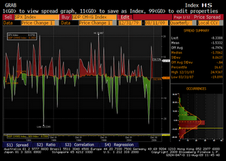
A previous post was about the S&P/Case-Shiller Home Price Index rising faster than US GDP. This can also be seen by plotting the quarterly percent changes of both indices. It's a bit geeky and makes for a busy chart, but at least we can clearly see the long period shown in green, stretching from 2000 to 2006 (and even starting in 1997 if we omit a couple of red quarters) during which the Home Price line, in amber, was significantly higher than the white GDP line. That is, during that time frame, home price changes where greater than GDP changes, on a quarter-to-quarter basis. This of course was not sustainable.

(click to enlarge)
Note that, before this long period of excess return on home prices, neither index was systematically increasing faster than the other, resulting in a pattern of red and green areas. These areas were smaller, too, indicating the differences between the two indices were tight and short-lived.
Interestingly, we see a similar phenomenon today with the S&P500 index: The S&P500 is plotted as a white line; red areas indicate period when the stock index rose faster than GDP, quarter-to-quarter.
From that standpoint, it looks indeed like the equity market is ahead of itself.


No comments:
Post a Comment